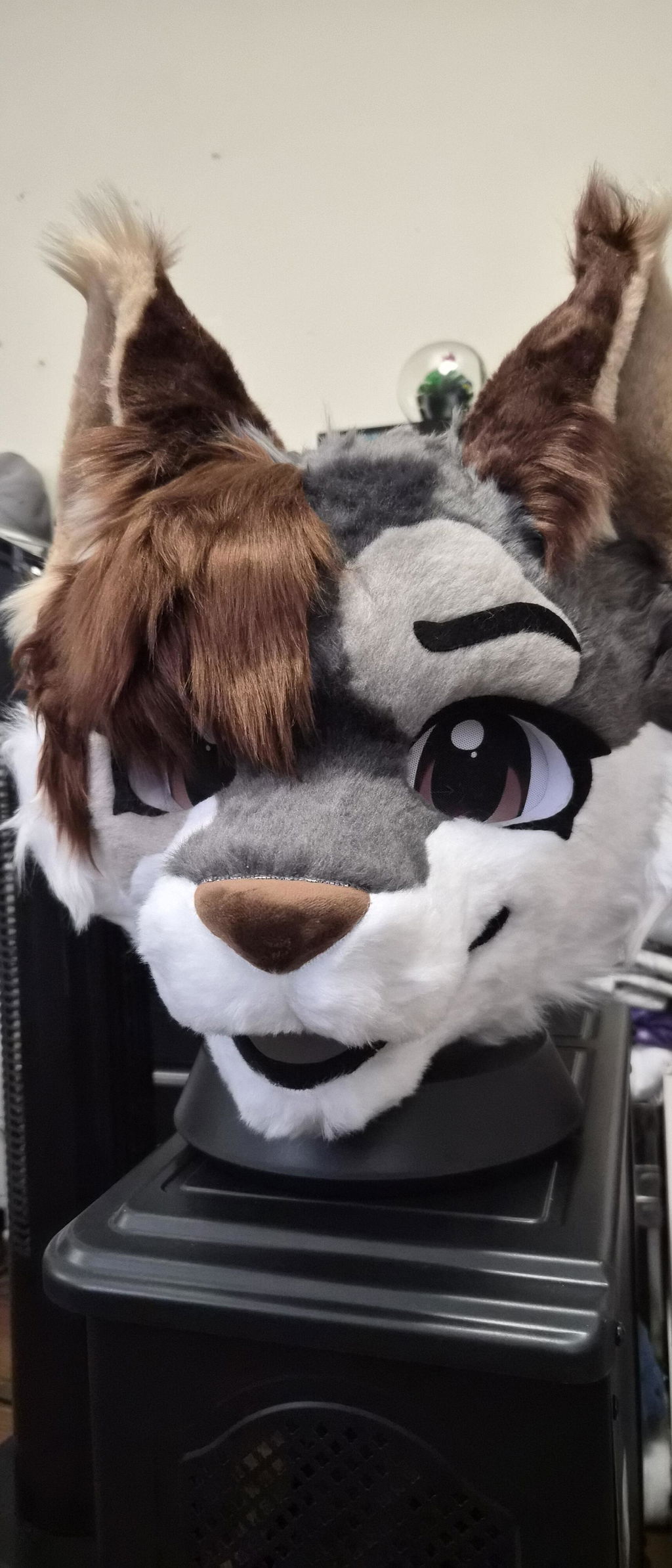
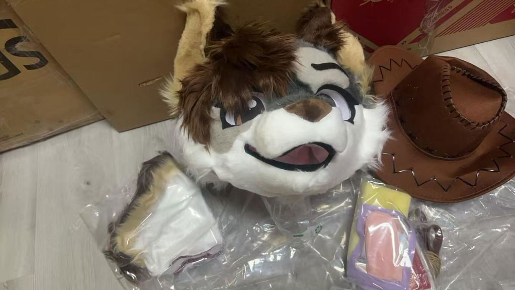
A kemono fursuit head is often the part people notice first, but choosing or designing one is not only about picking a cute species. The head has to communicate a character from a distance, remain readable in photos, and work with the way you actually move and interact. If you are comparing a premade head, planning a partial fursuit, or refining an original character, the most useful starting point is to separate visual decisions from wearability decisions.
This DokiDoki editorial focuses on the design problem behind a kemono fursuit head: how to make the face, ears, muzzle, markings, and expression work together. It also explains what to check when a real listing is your reference point. Product pages are included only as examples of available character directions; the goal is to help you understand your own brief before you make a selection.
Start with the character story, not the species label
Real use scenario: You have a character sheet with several favorite animals, colors, and accessories, but the face still feels generic when you imagine it at a convention. The head needs a clear identity before any single feature can carry the design.
Actionable advice: Write one sentence describing how the character should feel when someone sees them for three seconds. Then choose the facial features that support that sentence. A gentle character may benefit from a softer eye direction and rounded transitions, while an energetic character may need stronger contrast or a more alert silhouette. This is a design choice, not a promise about a maker’s construction method.
A useful fact from the current store catalog is that the available kemono examples span several animal directions, including a leopard, puppy, red panda, dragon, little lion, kitty, and wolf. That variety shows why “kemono” is a visual language rather than one fixed species appearance.
- Describe the character mood in one short sentence.
- Choose the species for the story it supports, not only for trend value.
- Keep three identifying traits that should remain visible in a small photo.
- Remove details that do not help recognition or comfort.
Build the face around a readable silhouette
Real use scenario: Your design looks attractive in a close sketch, yet the face loses its personality when viewed as a small avatar or from across a room. This usually means the outer shape and the internal markings are competing for attention.
Actionable advice: Make a simple black silhouette of the head, ears, and muzzle. Check whether the character is still distinguishable without color. Next, make a small grayscale version and check whether the eye area and muzzle separate from the base color. These two checks help you decide which features deserve volume and which can remain surface detail.
The catalog itself separates many products by a clear character name and number, such as “Kemono Leopard No.014” and “Kemono Puppy No.015.” Those labels are practical reference points: when comparing a premade design, record the recognizable silhouette and character direction rather than assuming every kemono head shares identical proportions.
- Test the outer head and ear outline at thumbnail size.
- Check the eye, muzzle, and cheek areas in grayscale.
- Give the strongest visual contrast to the feature that tells the story.
- Use a side view to catch a muzzle shape that only works from the front.
Use eyes and muzzle to set expression
Real use scenario: You want a friendly face, but your reference images keep producing a worried, sleepy, or stern expression. Small changes around the eyes and muzzle can alter the whole reading of a kemono fursuit head.
Actionable advice: Compare three expression sketches with the same colors and ears. Change only eye angle, pupil placement, brow marking, and mouth line. This isolates the feature that is causing the unwanted emotion. For a character intended for photos, favor an expression that remains legible under different lighting rather than one that depends on a tiny detail.
Do not treat a listing title as a guarantee of expression, vision, or fit. The store catalog supplies product names and URLs, but it does not replace the wearer’s measurements or a direct clarification of the exact item. If you are considering a premade option, use the product page as the factual source for what is listed and ask about any detail that is not stated.
- Make a neutral, cheerful, and focused expression study.
- Keep the eye direction consistent with the character’s personality.
- Check whether the muzzle still reads clearly in a three-quarter view.
- Ask for clarification rather than guessing about unstated construction details.
Make ears and markings support recognition
Real use scenario: Your character has dramatic ears or complex facial markings, but the head looks busy once all the elements are combined. The solution is to assign each feature a job.
Actionable advice: Decide whether the ears signal species, emotion, or both. Then limit the highest-contrast markings to the face areas that should guide the viewer’s eye. If the ears already create a strong outline, the cheeks can use quieter color transitions. If the head silhouette is simple, a cheek stripe or forehead marking can become the signature cue.
Species inspiration should remain a creative decision. A catalog name such as red panda or dragon can help you compare starting directions, but it does not dictate your original character. The useful comparison is whether the visual emphasis matches your intended story and whether you can maintain the design consistently across a head, paws, tail, or clothing.
- Assign the ears one primary visual function.
- Choose one signature marking and two supporting markings.
- Check left-right balance without forcing perfect symmetry.
- Repeat important colors in at least one other character component.
Plan vision and ventilation as part of the design
Real use scenario: You love a compact, expressive face but worry that a busy convention floor will make it difficult to orient yourself or take breaks. Wearability decisions should begin while the design is still flexible.
Actionable advice: Before committing to a head shape, list the activities you expect: walking, posing, talking with a handler, taking photos, eating, and removing the head for a break. Note which activities require the clearest view and which require the easiest removal. Ask the maker or seller for the item-specific information you need; never infer internal features from a product title or one photograph.
General safety planning is not a product specification. The current catalog can verify which products are listed and whether a numeric inventory value is available, but it cannot establish how a particular wearer will see, breathe, or feel in a head. For a real purchase, measurements, fit questions, and break planning belong in the decision.
- Map the activities that need the clearest forward view.
- Plan a handler signal for uncertainty or discomfort.
- Schedule regular breaks before the event becomes tiring.
- Confirm item-specific wearability information directly when it is not stated.
Compare premade examples without copying their assumptions
Real use scenario: You are browsing several available kemono designs and find yourself comparing only color or price. A better comparison records what each design teaches you about your own priorities.
Actionable advice: Create a small comparison table with four columns: silhouette, expression, character cue, and next question. For example, a Kemono Leopard can inspire a marking strategy, while a Kemono Puppy can prompt a softer expression study. Treat these as visual references, not as evidence that two products have the same construction, availability, or fit.
At the time of today’s catalog check, relevant product pages with numeric inventory included Kemono Leopard No.014, Kemono Puppy No.015, Kemono Red Panda No.019, and Kemono Dragon No.035. Inventory can change, so a product link should be checked again when you are ready to act. The comparison should still make sense even if one listing is no longer available.
- Compare design choices before comparing commercial details.
- Record one question for every listing you might consider.
- Separate catalog facts from your personal comfort requirements.
- Keep an alternative character direction in case availability changes.
Connect the head to the rest of the character
Real use scenario: The head looks complete by itself, but the finished character feels disconnected because the body colors, paws, or tail do not repeat its visual language. A convincing partial fursuit depends on coordination.
Actionable advice: Pull a small palette from the head and assign each color a role: base, contrast, accent, and quiet neutral. Repeat the accent on one wearable component, but do not place every marking everywhere. The head should remain the focal point. If you are building a partial, decide whether the visible neck, hands, and footwear create a clean transition from the head.
DokiDoki’s catalog includes both character-led premade listings and separate accessory or partial-oriented products. That makes the planning question more useful than a simple “head or full suit” choice: decide which components will be visible together and which ones need to carry recognition when the head is removed.
- Assign roles to colors instead of spreading them evenly.
- Repeat one signature accent outside the face.
- Check the character in the exact partial coverage you expect to wear.
- Keep the head readable when accessories are added.
Turn your design notes into a clear request
Real use scenario: You are ready to ask a maker a question, but your message contains many inspirational images and no clear priority. A concise brief reduces avoidable back-and-forth.
Actionable advice: Put the non-negotiables first: character name, species direction, expression, essential markings, approximate measurements, intended coverage, and event timing. Then list flexible details. Link only to exact store pages when you are referring to a real catalog item, and label inspiration separately from requirements. If something affects fit, vision, or comfort, ask a direct question instead of relying on a similar-looking photo.
A good brief is valuable even when you choose a premade head. It lets you compare the listing against your character rather than letting the listing redefine the character by accident. If the request is custom, the same notes help everyone discuss the design without claiming an unpublished process or a result that has not been agreed.
- Separate essential traits from flexible preferences.
- Include measurements and intended use when fit matters.
- Label each image as reference, requirement, or color inspiration.
- Ask for confirmation of anything not stated on the product page.
Check the final head with a real-life test plan
Real use scenario: The head is visually finished and you are preparing for its first outing. The last useful check is not another round of styling; it is a short, realistic rehearsal.
Actionable advice: Wear the complete planned outfit for a brief indoor session. Practice turning, looking down, greeting someone, taking a photo, and removing the head for a break. Note pressure, heat, visibility, and any accessory that catches or shifts. A rehearsal cannot prove every future experience, but it can reveal questions early enough to ask for help.
For a DokiDoki character assembled from a current listing, keep the product page and your order information together. Today’s verified catalog confirms the availability of the linked examples, while your personal test confirms whether the chosen combination suits your routine. Those are different kinds of evidence and should not be confused.
- Rehearse the movements you will use at the event.
- Test the full combination of head, paws, tail, and clothing.
- Write down every uncertainty before the first public outing.
- Plan cleaning, storage, and transport immediately after use.
A strong kemono fursuit head is a character decision and a wearability decision at the same time. Start with the story, make the silhouette readable, let the eyes and markings carry the expression, and connect the head to the way you will actually live in the character. When a premade example helps, use its verified page as a reference point while keeping your own requirements in charge. That approach gives you a clearer brief, better questions, and a design that still feels like yours when the first impression has passed.