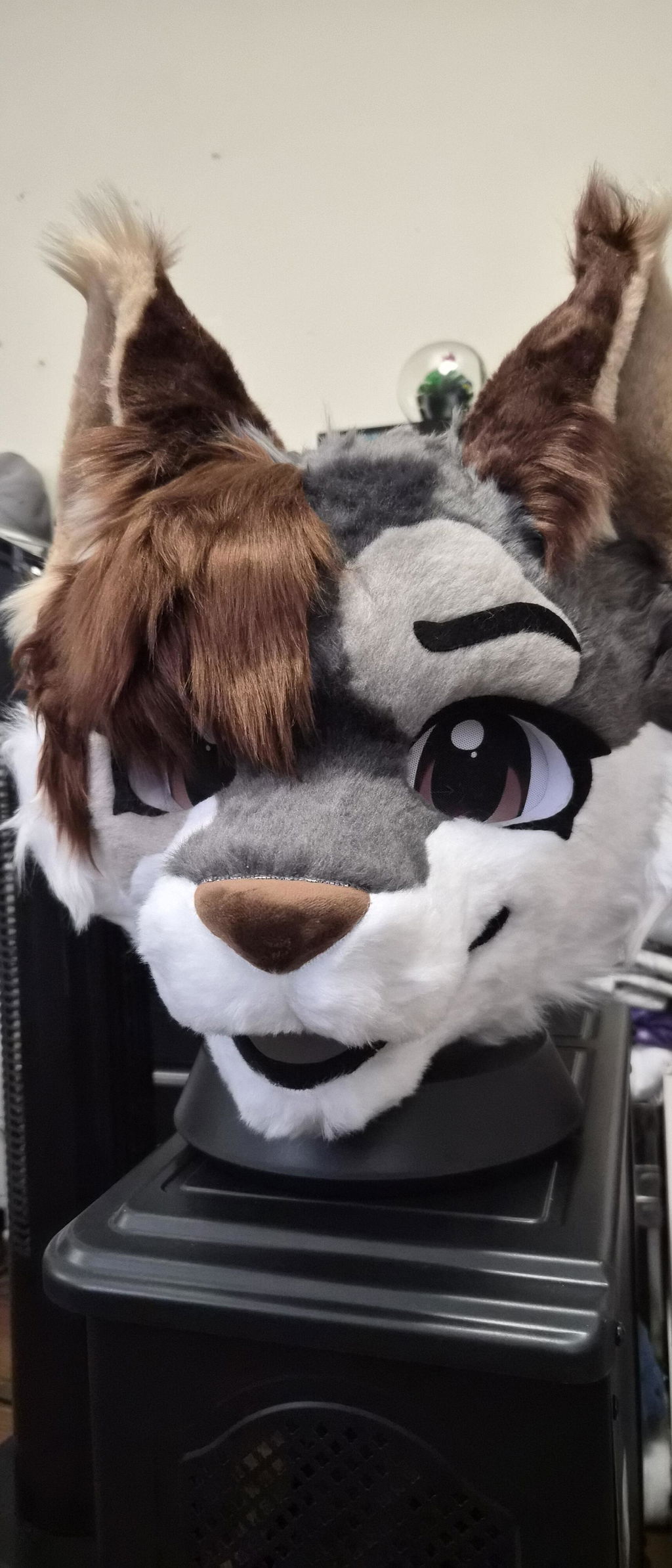
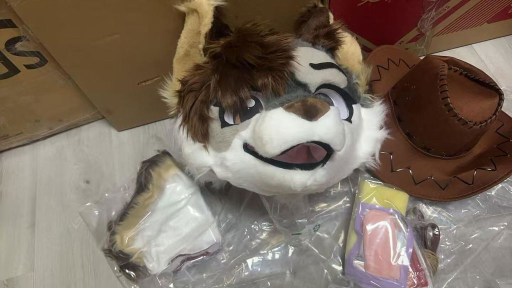
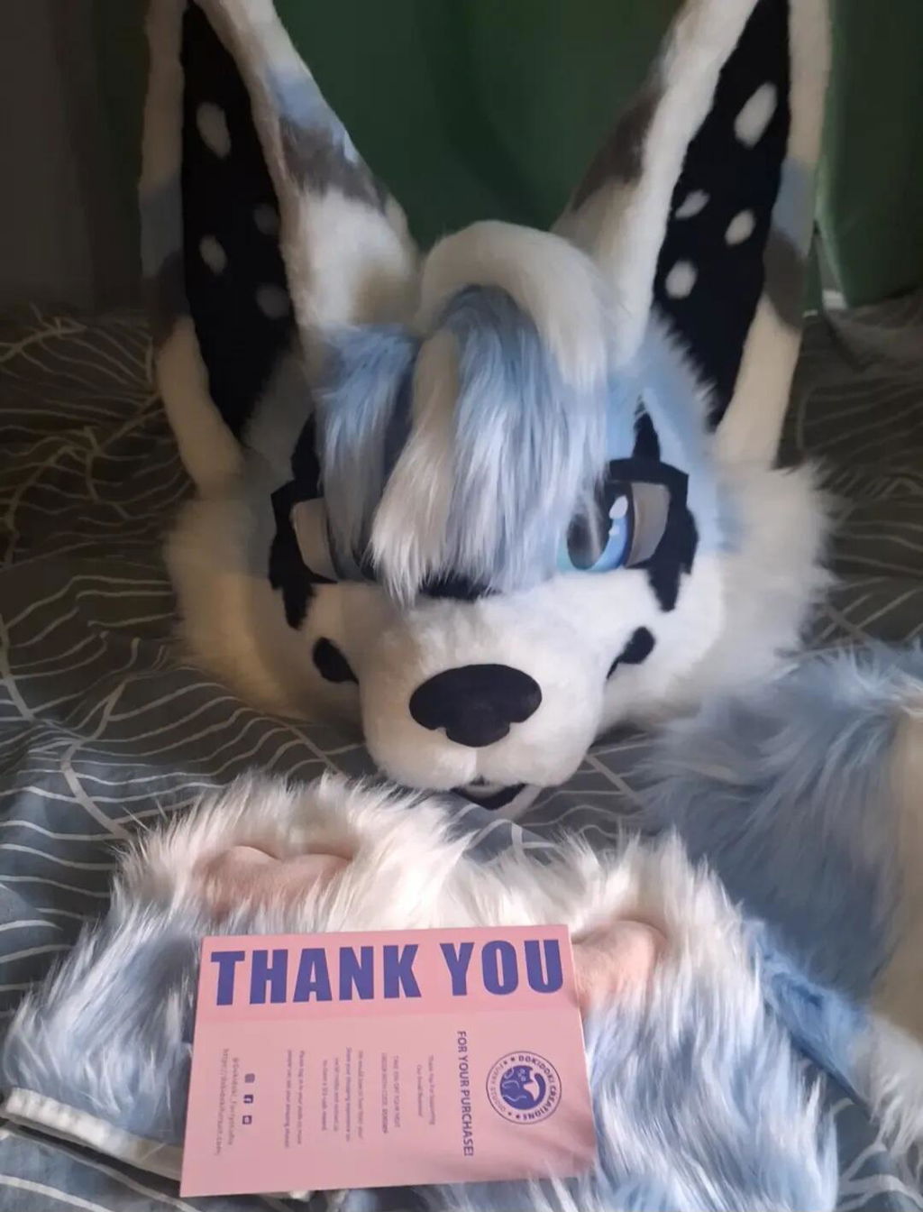
Kemono designs can look simple at first glance because their large shapes and clear facial language are easy to recognize. The harder part is keeping those choices coherent when you add markings, ears, muzzle, accessories, and real-life movement. Many design problems are not caused by one “wrong” feature; they appear when several individually attractive decisions compete for the same attention.
This article is a troubleshooting-style review of common kemono design mistakes. It helps you diagnose an unclear silhouette, a crowded face, colors that disappear in photos, markings that do not travel across the character, and a partial outfit that feels unfinished. It also explains when a visual issue is actually a fit or product question that should be asked directly.
When the character has no clear first cue
Real use scenario: You have a species, palette, and several references, but people need an explanation before they understand what makes the character special.
Actionable advice: Write the one cue that should survive a three-second view. It may be the muzzle shape, ear outline, eye expression, or a bold marking. Remove other high-contrast details temporarily and test whether that cue still leads the eye. If it does not, simplify before adding more decoration.
The current DokiDoki catalog includes different Kemono directions such as leopard, puppy, red panda, dragon, kitty, and wolf. Those product names show the breadth of species references, not a universal Kemono formula. Use the species name to organize the brief, then decide what your own character must communicate.
- Name the first visual cue.
- Test it at thumbnail size.
- Lower contrast around competing details.
- Review the cue from front and three-quarter views.
When the silhouette works only from the front
Real use scenario: The face looks excellent in a front sketch, but the character becomes generic from the side or when photographed walking through a room.
Actionable advice: Make a three-view outline with no internal color. Check head width, ear direction, muzzle projection, cheek volume, body line, and tail relationship. Choose one side-view feature that carries identity. A strong silhouette should not depend entirely on a front-facing marking.
This test diagnoses the design shown in a reference; it does not establish a product’s construction or fit. When you evaluate a listing, use the views that are actually provided and ask about any angle that matters but is not shown.
- Draw front, side, and three-quarter outlines.
- Choose a side-view recognition feature.
- Do not use markings to hide an unclear outline.
- Check the character at walking distance.
When the eyes and muzzle tell different stories
Real use scenario: You want a gentle character, but the eye angle looks alert while the muzzle reads stern, or the opposite happens.
Actionable advice: Create three expression studies using the same colors and silhouette. Change only eye direction, brow or forehead markings, mouth line, and muzzle emphasis. Compare the emotional reading without adding accessories. Keep the expression that matches the character sentence you wrote first.
A product title can identify a listing such as Kemono Puppy No.015 or Kemono Dragon No.035, but it cannot promise how a particular wearer will read the expression. Treat names as catalog facts and your interpretation as a design decision.
- Test neutral, friendly, and focused expressions.
- Change one facial variable at a time.
- Check the expression in three-quarter view.
- Ask direct questions about unstated visibility or fit details.
When markings become visual noise
Real use scenario: The face has stripes, cheek patches, gradients, and accents, but the viewer does not know where to look.
Actionable advice: Sort markings into primary, supporting, and optional. Let the primary marking guide the eye toward the face or species cue. Keep quieter areas around it. Test the design in grayscale and at small size before committing to another contrast color.
Marking advice is a way to reason about a design, not a claim about a listing’s material or finish. If a real product page shows a pattern that inspires you, record the visible reference separately from the requirements of your own character.
- Choose one primary marking group.
- Use supporting markings to reinforce recognition.
- Reduce contrast in crowded areas.
- Check grayscale and thumbnail versions.
When the palette changes the species cue
Real use scenario: Your colors are beautiful, but the character’s species direction becomes hard to read because the face, ears, and body no longer share a visual language.
Actionable advice: Assign colors roles: base, contrast, accent, and neutral. Use the base to connect the character, the contrast to separate forms, and the accent to create a memorable cue. If you want a fantasy palette, keep at least one shape or marking that carries the species idea.
Catalog names such as Kemono Red Panda No.019 and Kemono Leopard No.014 can help you compare different species starting points. They do not mean a color choice must follow a natural pattern. The useful check is whether your invented palette still supports your intended character story.
- Give every color a role.
- Keep one clear species-supporting cue.
- Use accents sparingly around the focal point.
- Check the palette in different light assumptions.
When accessories compete with the head
Real use scenario: You add horns, hair, glasses, bows, or props, and the character becomes harder to read even though every accessory looks good alone.
Actionable advice: Give each accessory one job: silhouette, story, movement, or comfort. If two details do the same job, keep the clearer one. Step back from the design and check whether the face remains the first point of contact.
The store catalog contains both full character listings and separate component products. That makes it possible to plan an assembled look, but it does not prove that every accessory is necessary or compatible. Decide what the character needs before using a product page as a shopping prompt.
- Assign each accessory a single purpose.
- Keep the face visually dominant.
- Check movement with the full combination.
- Confirm compatibility instead of inferring it from photos.
When a partial outfit looks unfinished
Real use scenario: The head is strong, but the character loses cohesion when you wear only a head and paws or head, paws, and tail.
Actionable advice: Draw the exact coverage you expect to wear. Check exposed neck, wrists, ankles, and waist for intentional color transitions. Repeat one head accent on a visible component, but do not copy every facial marking across the whole outfit.
The catalog has available Kemono character listings and separate accessory categories. Product pages can provide concrete references, while your coverage plan decides which transitions need attention. A partial should look deliberate because the visible edges were planned, not because it contains every possible component.
- Sketch the real coverage combination.
- Plan transitions at every exposed edge.
- Repeat one signature accent.
- Keep the head as the visual anchor.
When a listing comparison creates false certainty
Real use scenario: Two listings look similar, and you start assuming they share the same fit, construction, care requirements, or included pieces.
Actionable advice: Separate what the page visibly states from what you still need to ask. Save the exact URL, list the missing facts, and avoid transferring an answer from one item to another. If the question affects measurements, vision, ventilation, or care, ask it directly.
Today’s verified catalog includes Kemono Leopard No.014, Kemono Puppy No.015, Kemono Red Panda No.019, and Kemono Dragon No.035 with numeric inventory available at the time of drafting. These links identify real pages; they do not make unstated promises about the items.
- Keep catalog facts and assumptions separate.
- Ask item-specific questions.
- Do not transfer fit information between listings.
- Recheck availability when you are ready to act.
When a design issue is really a wearability issue
Real use scenario: You keep changing the face or silhouette because the character does not feel right, but the real concern is visibility, movement, heat, changing, or the way the planned coverage feels.
Actionable advice: Rehearse the intended combination indoors. Practice turning, sitting, posing, greeting, and taking a break. Write down which observations are artistic and which are practical. Send practical questions to the maker or seller rather than trying to solve them by adding decoration.
DokiDoki pages can help you identify the exact listing and available product information. They cannot certify how every wearer will experience a suit. Personal measurements, use conditions, and direct clarification belong in the final decision.
- Practice the movements you will repeat.
- Separate appearance problems from comfort questions.
- Plan breaks and handling before the first event.
- Escalate uncertain structural or fit issues.
Use a simple diagnosis order when several issues appear at once. Start with the outline, then check the face, then the palette, then the markings, and only afterward add accessories. Earlier decisions affect later ones: an unclear silhouette can make the face seem wrong, and excessive contrast can make a good silhouette disappear. Change one variable at a time and save a version of the design before each meaningful change. This gives you evidence about what helped instead of relying on a general feeling that the character is “too much” or “not enough.” If the design is based on a real listing, keep the item identity and your design interpretation separate so you do not accidentally describe an imagined feature as a product fact.
A helpful final check is to ask someone who has not seen the mood board what they notice first. Do not ask them to guess the species perfectly; ask them to describe the mood, shape, and most visible feature. Their answer can reveal whether the character’s intended cue is actually doing its job. Use the feedback as a design clue, not as a vote that overrides your own requirements.
For a wearable character, finish the diagnosis with the real setting in mind. View the design in a small photo, imagine it at a crowded convention, and check the exact partial coverage you expect to use. A feature that looks subtle on a screen may become the strongest cue at distance, while a detail that looks dramatic may disappear when the head turns. This is why a short rehearsal and a few simple views are more reliable than endlessly collecting references. Keep the final brief focused on the cue, the mood, the coverage, and the questions that still need an answer.
That final check keeps revisions practical.
Keep the primary cue clear while you revise.
Stay concise now.
DokiDoki readers can use the same checks when reviewing a new character direction.
Kemono troubleshooting is often a process of removing confusion: choose one first cue, test the silhouette from more than one angle, align the eyes and muzzle, control marking contrast, and plan the visible edges of the outfit. When a catalog page helps you compare directions, use its exact facts without filling gaps by assumption. A clear character brief and a short rehearsal can solve more than another round of decorative changes.