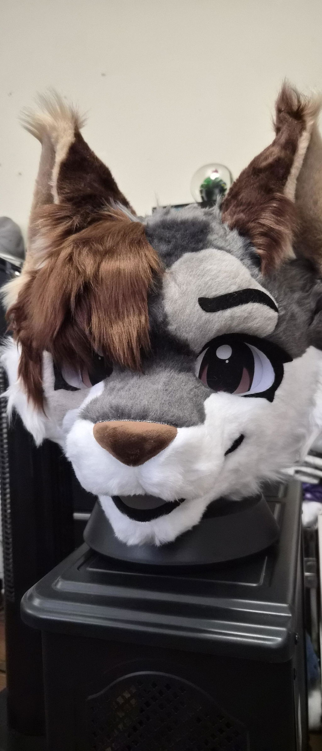
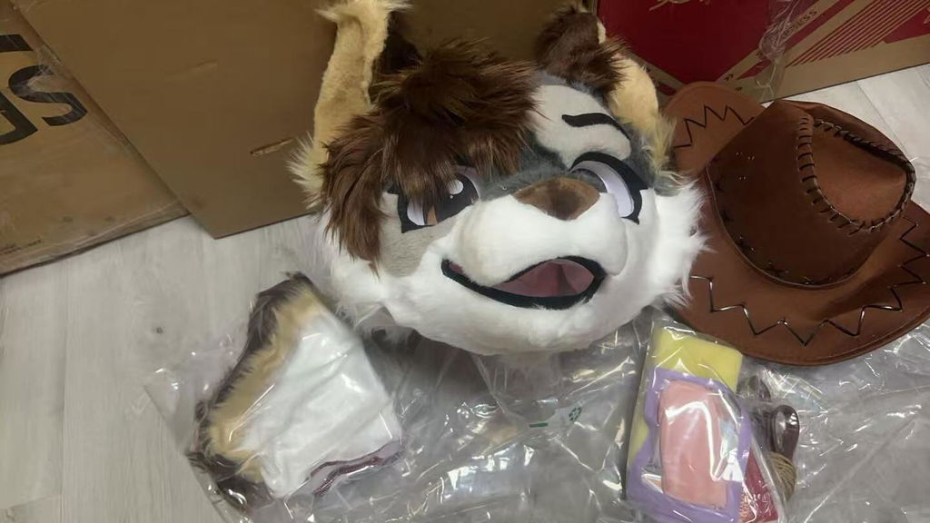
A moth fursuit can communicate a character through more than wings and soft colors. The strongest designs give the viewer a clear reason to notice the face, a memorable relationship between body and wing shapes, and a color story that still reads when the character is moving. If you are building an original character or comparing a moth-inspired listing, start with the feeling and movement you want before adding every available detail.
This article focuses on species and character inspiration rather than a universal purchase template. It looks at silhouette, wing language, antennae, markings, nighttime palettes, partial coverage, posing, and event practicality. Product pages appear as concrete references for adjacent moth, butterfly, and bat directions; the exact facts of each item remain on its own listing.
Choose the moth feeling before choosing the pattern
Real use scenario: You like several moth images, but one feels dreamy, another mysterious, and another playful. Copying all three moods can leave the character without a clear center.
Actionable advice: Write one sentence about what the character should make people feel when they first see it. Then select two visual traits that support that sentence. A quiet nocturnal character might use restrained contrast and slower gestures, while a playful character might use brighter accents and a more open silhouette. The sentence keeps the design from becoming a collection of unrelated references.
The current DokiDoki catalog contains a Toony Fantasy Moth No.361 and a Kemono Butterfly Cat No.407, among other winged or bat-inspired listings. Those names show different starting points, not a fixed definition of moth style. Use them to compare character direction, then define your own intent.
- Describe the first emotional impression.
- Choose two traits that support it.
- Keep the species cue visible in small images.
- Remove details that compete with the core feeling.
Build a wing silhouette that works in motion
Real use scenario: The wing artwork looks beautiful in a flat reference image, but the character loses its identity when the wings fold, turn, or appear behind the body.
Actionable advice: Draw the character from front, side, and three-quarter views with the wings open and at rest. Decide which edge, color block, or shape should remain recognizable in each position. If the wings are a major storytelling feature, plan a pose that gives them space rather than treating them as decoration added at the end.
A silhouette test is a design method, not a specification about any listing. It helps you explain the visual priority to a maker and helps you compare a premade design without guessing how a photographed feature behaves in every pose.
- Test open, folded, and side-view wing shapes.
- Choose one signature wing edge.
- Check recognition without internal markings.
- Design a pose that gives the wings room.
Use antennae and ears as a character signal
Real use scenario: You have a moth concept with antennae, ears, or both, but the upper silhouette feels crowded and the face loses attention.
Actionable advice: Give each upper feature a job. Antennae can suggest curiosity or softness, ears can carry species or emotion, and the eyes can remain the main point of contact. Draw a simple outline with only the upper features, then remove one element and see whether the character becomes clearer or less distinctive.
The catalog includes several winged directions, including bat and butterfly examples, but a product name does not decide how your original character should combine cues. Separate inspiration from requirements so the final brief can say exactly which features matter.
- Assign each upper feature one visual role.
- Keep the face readable between the shapes.
- Test the silhouette without color.
- Label borrowed inspiration separately from must-have traits.
Make nighttime colors readable in photos
Real use scenario: Your palette is mostly dark blue, violet, or black, and the markings disappear in indoor event lighting or a small phone image.
Actionable advice: Create a grayscale thumbnail and place the strongest contrast near the feature you want people to notice. Then add one accent color that can repeat on the wings, face, paws, or clothing. If every section has equal contrast, reduce the number of competing focal points.
Color advice cannot establish how a specific material or camera will reproduce a shade. Use a clear palette reference for the character, and treat a product listing’s visible colors as evidence for that listing only. If an exact shade matters, ask the relevant question directly.
- Check the palette in grayscale.
- Place contrast near the intended focal point.
- Repeat one accent beyond the wings.
- Describe color relationships, not only color names.
Give markings a rhythm instead of filling every space
Real use scenario: You have eye spots, stripes, gradients, and edge markings, but the design feels busy when the face and wings are viewed together.
Actionable advice: Choose one primary marking, one supporting marking, and one small surprise detail. Let the primary marking guide the eye and allow quieter areas around it. Check whether the markings remain balanced when the character turns, rather than demanding perfect symmetry in every view.
A listing such as Toony Fantasy Moth No.361 can be a useful reference for a moth direction, while a Butterfly Cat listing can suggest a different species blend. The factual point is the existence of these catalog examples; your own marking system still needs to be defined independently.
- Limit the number of high-contrast marking groups.
- Repeat patterns only when they help recognition.
- Check markings in front and three-quarter views.
- Leave quiet areas around the main focal point.
Connect the wings to the rest of the outfit
Real use scenario: The wings look complete by themselves, but the head, paws, tail, or clothing feel like separate pieces once the whole character is assembled.
Actionable advice: Pull a small palette from the wing design and assign each color a role elsewhere. Repeat one accent on the face or paws, but avoid copying every wing marking onto the body. If you are planning a partial fursuit, check the exposed neck, wrists, and waist for intentional transitions.
The DokiDoki catalog includes separate component listings as well as full character examples. That supports a planning approach in which you decide the visible combination first and then ask which components are necessary. A component listing should not be treated as proof that every combination is automatically compatible.
- Repeat one wing accent outside the wings.
- Keep the head as the visual anchor.
- Check partial coverage at every exposed edge.
- Confirm measurements before combining separate items.
Use movement to express moth character
Real use scenario: The design is visually strong when standing still, but you do not know how the character should greet someone, pose for photos, or move through a crowded event.
Actionable advice: Choose three repeatable gestures: a curious head turn, a wing-aware photo pose, and a relaxed resting pose. Practice them without forcing your body into an uncomfortable position. The gestures should support the mood you wrote at the beginning and should still read when the wings are not fully open.
Movement is personal evidence, not a claim about a product’s fit or construction. A rehearsal helps you identify questions about visibility, balance, and comfort that belong with the maker or seller before public wear.
- Pick three gestures that match the character mood.
- Practice with the intended coverage.
- Keep movement expressive but comfortable.
- Write down unanswered visibility or fit questions.
Compare moth-adjacent references thoughtfully
Real use scenario: You find bat, butterfly, and moth-inspired listings and are unsure whether looking at adjacent species will weaken your character direction.
Actionable advice: Compare references by the design job they solve. A bat example may help with ear and wing silhouette, a butterfly example with color rhythm, and a moth example with nocturnal mood. Keep the final character brief specific about which cue you are borrowing and which cue remains your own.
Current catalog examples include Toony Fantasy Moth No.361, Kemono Butterfly Cat No.407, Kemono Bat No.164, and Purple Bat Ear Toony Partial Fursuit. These links identify real available pages from today’s catalog check; they do not claim that the items share construction, fit, or exact style.
- Borrow a design lesson, not an entire identity.
- Label each reference by its visual job.
- Keep the moth cue clear in the final brief.
- Recheck live listing details when you are ready to act.
Turn inspiration into a concise final brief
Real use scenario: You are ready to ask a question or decide between a custom direction and a real listing, but your references still have no priority order.
Actionable advice: Put the character sentence first, then list species direction, silhouette cue, expression, palette roles, markings, wing behavior, intended coverage, event setting, measurements, and open questions. Label each detail as essential, flexible, or inspiration. This keeps a beautiful mood board from becoming an unclear instruction sheet.
At DokiDoki, an exact product page can anchor a comparison, while your brief explains what you need from the character. Do not claim an unstated specification or assume a promise from a similar image. Ask directly, save the answer with the page, and keep your own wearability requirements visible.
- Rank the character priorities.
- Separate essential details from inspiration.
- Include coverage and real-life setting.
- Save direct answers with the exact page.
Before you settle on the final direction, review the design at three distances. At close range, check whether the face and markings feel intentional. At conversational distance, check whether the silhouette and main colors still identify the character. In a small photograph, check whether the strongest cue survives without explanation. If the answer changes at each distance, decide which audience matters most and simplify the competing details. This review is especially useful for winged characters because open wings can dominate one view and disappear in another. It also gives you a practical reason to keep one clear accent on the head or hands rather than placing all of the visual information on the wings.
Keep a short note about the pose, color, and wing detail that mattered most in your decision. That note will help you judge future accessories without losing the character’s original direction.
Use that note as a small guardrail when new inspiration appears later.
A clear guardrail keeps the character recognizable as the design grows.
Keep the core cue visible in every final view.
Keep it recognizable.
A moth fursuit works when the species inspiration supports a character people can recognize and you can comfortably express. Start with the feeling, build the wing silhouette, give antennae and markings clear jobs, make the palette readable, and connect the wings to the rest of the outfit. When adjacent bat or butterfly references help, borrow their design lesson without losing the moth identity. That approach creates a stronger brief and a more intentional character from the first sketch to the first event.